Sleek Under Construction Page with Two-Column Layout and Gradient Background in HTML/CSS
Introduction:
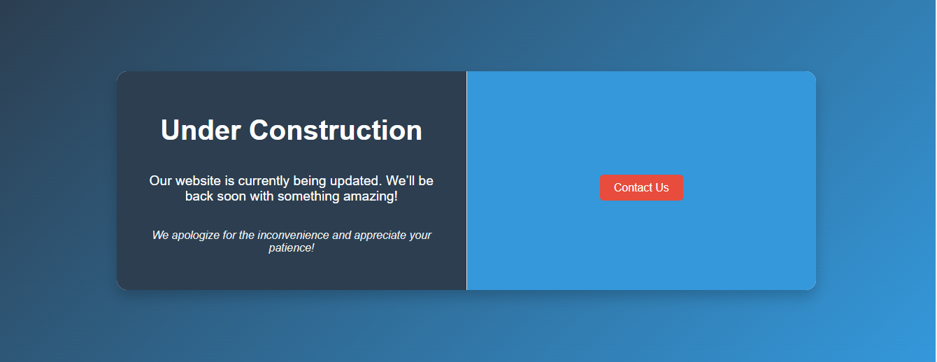
A well-designed “Under Construction” page is essential for maintaining a professional image while your website undergoes updates. In this guide, we present a sleek “Under Construction” page featuring a two-column layout and a sophisticated gradient background. This design not only communicates that your site is temporarily unavailable but also engages visitors with a modern and visually appealing interface, ensuring they stay informed and connected during the transition.
HTML Code
[acf_code_field]
    <title>Under Construction</title>

        body, html {
            margin: 0;
            padding: 0;
            height: 100%;
            width: 100%;
            display: flex;
            justify-content: center;
            align-items: center;
            background: linear-gradient(135deg, #2c3e50, #3498db); /* Gradient background */
            font-family: 'Arial', sans-serif;
            color: #fff;
        }

        .container {
            display: flex;
            width: 80%;
            max-width: 1000px;
            height: 60%;
            background: #ffffff; /* Solid background for the container */
            border-radius: 15px;
            box-shadow: 0 10px 20px rgba(0, 0, 0, 0.2);
            overflow: hidden;
        }

        .left-column, .right-column {
            flex: 1;
            padding: 40px;
            display: flex;
            flex-direction: column;
            justify-content: center;
            align-items: center;
        }

        .left-column {
            border-right: 1px solid #ddd;
            background: #2c3e50; /* Dark background for the left column */
        }

        .right-column {
            background: #3498db; /* Blue background for the right column */
        }

        h1 {
            font-size: 2.5em;
            margin-bottom: 0.5em;
            color: #ffffff; /* White color for header */
        }

        p {
            font-size: 1.2em;
            color: #ffffff;
            text-align: center;
        }

        .sorry-message {
            font-size: 1em;
            margin-top: 1em;
            color: #ecf0f1;
            font-style: italic;
        }

        .cta {
            margin-top: 20px;
        }

        .cta a {
            text-decoration: none;
            color: #ffffff;
            background: #e74c3c;
            padding: 10px 20px;
            border-radius: 5px;
            font-size: 1em;
            transition: background 0.3s;
        }

        .cta a:hover {
            background: #c0392b;
        }

        @media (max-width: 768px) {
            .container {
                flex-direction: column;
                height: auto;
            }

            .left-column {
                border-right: none;
                border-bottom: 1px solid #ddd;
            }
        }


    <div class="container">
        <div class="left-column">
            <h1>Under Construction</h1>
            <p>Our website is currently being updated. We’ll be back soon with something amazing!</p>
            <p class="sorry-message">We apologize for the inconvenience and appreciate your patience!</p>
        </div>
        <div class="right-column">
            <div class="cta">
                <a href="#">Contact Us</a>
            </div>
        </div>
    </div>
Conclusion
A sleek “Under Construction” page with a two-column layout and gradient background is a perfect solution to keep your website looking professional while updates are underway. This design ensures that visitors are informed and engaged through a modern, visually appealing interface. By implementing this stylish and functional page, you can maintain a strong online presence and reassure your audience that exciting new features are on the way.
Facebook
Twitter
LinkedIn
WhatsApp
Email
X
Print

