Code Lab Pro

Bootstrap responsive table html css source code

Bootstrap responsive table html css source code

Introduction:

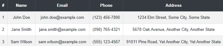
In the realm of web development, displaying data in an organized and accessible manner is a crucial aspect of creating user-friendly applications. Tables are a common method for presenting data, but ensuring they are responsive and look good on all devices can be challenging. This is where Bootstrap, a powerful front-end framework, comes into play. Bootstrap provides a variety of components and utilities that simplify the process of creating responsive tables, ensuring your data is presented clearly and professionally, regardless of the device being used. Bootstrap’s responsive tables adjust and reformat themselves based on the screen size, making sure that the table content remains readable and accessible on desktops, tablets, and mobile devices. By utilizing Bootstrap’s grid system and table classes, you can easily create tables that are not only functional but also visually appealing. This tutorial will guide you through the steps to create a responsive table using Bootstrap, complete with HTML and CSS source code. Bootstrap responsive table html css source code

HTML Code


    <title>Bootstrap Responsive Table</title>
    <!-- Bootstrap CSS -->
    
    
        body {
            background: #f8f9fa;
            font-family: Arial, sans-serif;
            padding: 20px;
        }
        .table-container {
            margin: 0 auto;
            max-width: 1000px;
            overflow-x: auto;
        }
        .table {
            background: #ffffff;
            border-radius: 5px;
            box-shadow: 0 4px 8px rgba(0, 0, 0, 0.1);
            margin-bottom: 20px;
        }
        th, td {
            text-align: center;
            vertical-align: middle;
        }


    <div class="table-container">
        <table class="table table-striped table-bordered table-responsive">
            <thead class="thead-dark">
                <tr>
                    <th>#</th>
                    <th>Name</th>
                    <th>Email</th>
                    <th>Phone</th>
                    <th>Address</th>
                </tr>
            </thead>
            <tbody>
                <tr>
                    <td>1</td>
                    <td>John Doe</td>
                    <td>john.doe@example.com</td>
                    <td>(123) 456-7890</td>
                    <td>1234 Elm Street, Some City, Some State</td>
                </tr>
                <tr>
                    <td>2</td>
                    <td>Jane Smith</td>
                    <td>jane.smith@example.com</td>
                    <td>(098) 765-4321</td>
                    <td>5678 Oak Avenue, Another City, Another State</td>
                </tr>
                <tr>
                    <td>3</td>
                    <td>Sam Wilson</td>
                    <td>sam.wilson@example.com</td>
                    <td>(555) 123-4567</td>
                    <td>91011 Pine Road, Yet Another City, Yet Another State</td>
                </tr>
            </tbody>
        </table>
    </div>

    <!-- Bootstrap JS and dependencies -->


Conclusion

In conclusion, creating responsive tables using Bootstrap is a powerful way to enhance the functionality and visual appeal of your web applications. Bootstrap’s built-in table classes and grid system simplify the process of making tables that adapt to different screen sizes, ensuring that your data remains accessible and easy to read on any device. By leveraging Bootstrap’s features, you can create tables that are not only functional but also aesthetically pleasing. Throughout this tutorial, we have explored how to set up a basic HTML structure and enhance it with Bootstrap’s responsive table classes. We have also looked at customizing the table’s appearance with CSS to match your application’s design. By following the provided code snippets and best practices, you can create tables that seamlessly adjust to various devices, offering a consistent user experience.
Facebook
Twitter
LinkedIn
WhatsApp
Email
X
Print
Scroll to Top